No. 05Wexford BusCase study
Simplified booking for Wexford Bus, lifting ticket sales by 19% and cutting phone calls by 29%
The call
Cut booking down to three clear steps, with a timeline showing passengers where they are, so booking online was easier than calling.
A new website, app and booking system for an Irish coach operator.
- Role
- Lead UX and UI designer
- Team
- A small design and development team
Context
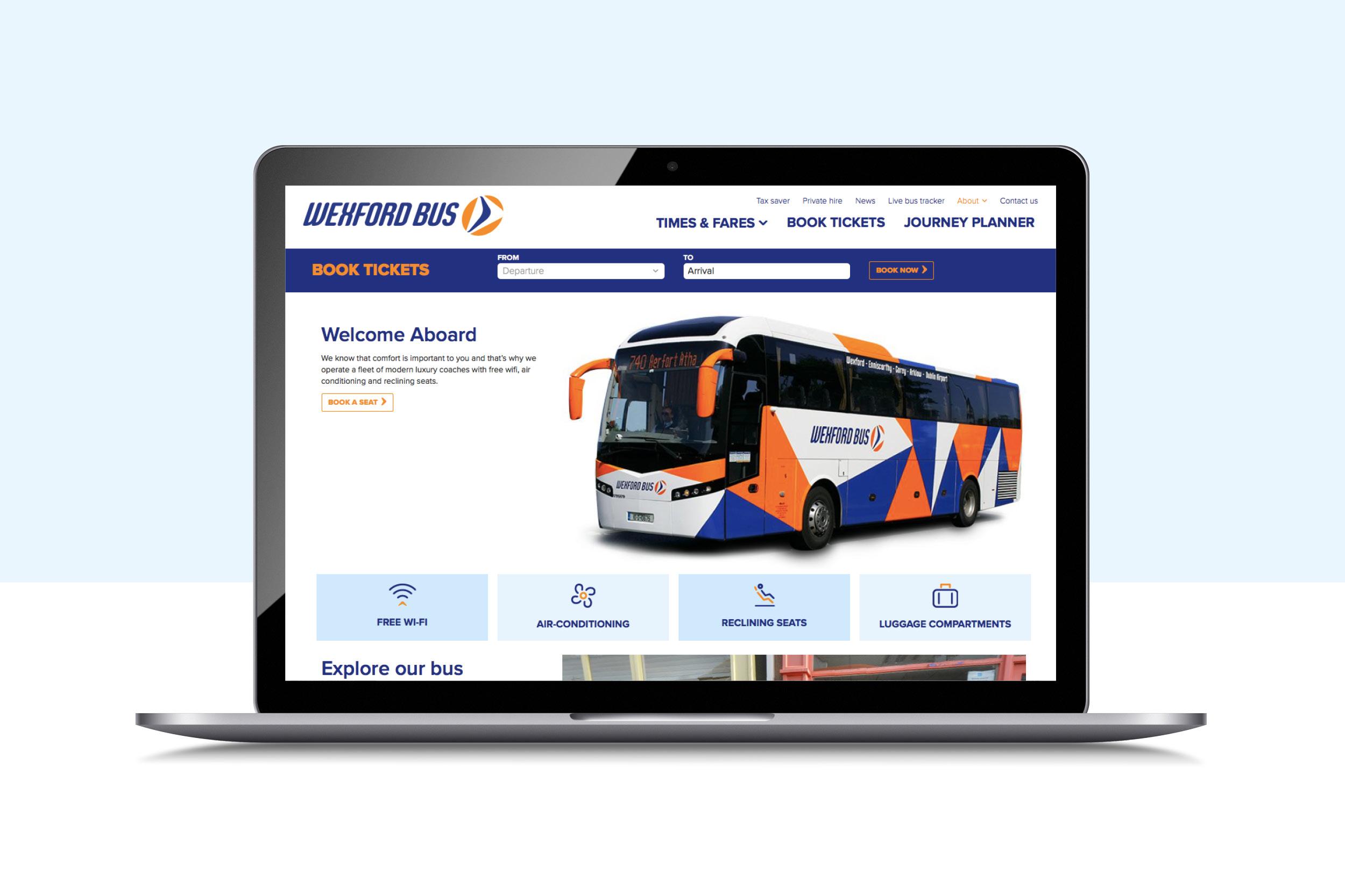
Wexford Bus runs coach services between Wexford, Dublin City and Dublin Airport. It wanted to refresh its online presence and bring in a new app and online booking system.
The aim was to overhaul the experience and the visuals together, with a distinctive visual language that would stand out from competitors.
The problem
Wexford Bus wanted more passengers booking online, and fewer calling with questions. The project goals were to:
- Deliver a fully responsive booking system
- Give a seamless experience across mobile, tablet and desktop
- Increase web traffic and online bookings
- Reduce phone calls and queries, by making the process intuitive
What I did
Research first
We began with foundational research, to immerse the whole team in the world of travel and online booking. We studied best-in-class booking systems and their journeys; Work&Co's redesign for Virgin America was a particular inspiration, technically, functionally and in the experience it created.
We interviewed customers and reviewed the strengths and weaknesses of direct and international competitors. From that we built a set of personas, so the needs of every kind of passenger were accounted for, then mapped the customer journey and planned the user flow.
Sketching the booking flow
I sketched the mobile booking flow on paper first: journey details, then date, time and tickets, then the choice of specific services.
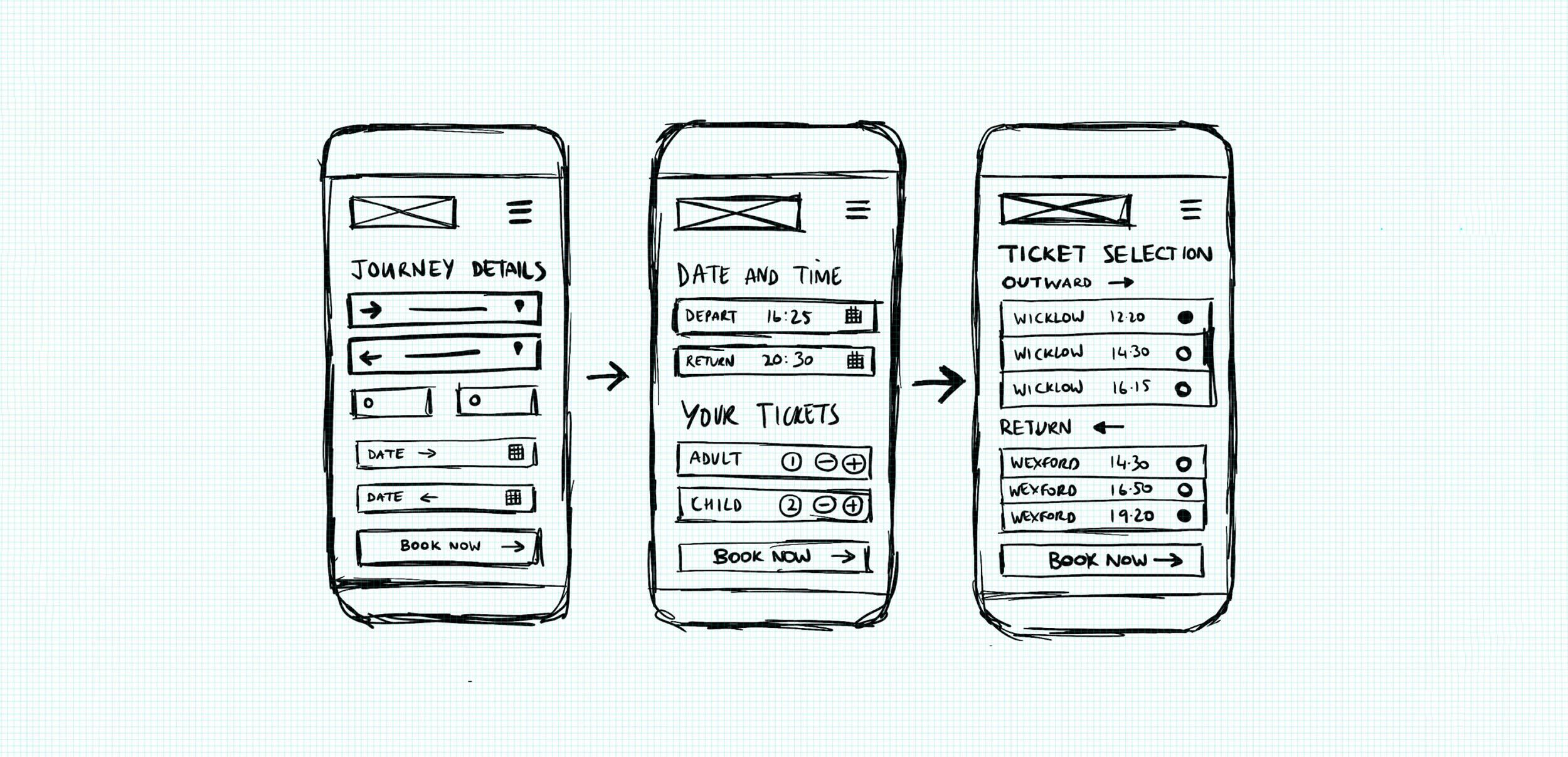
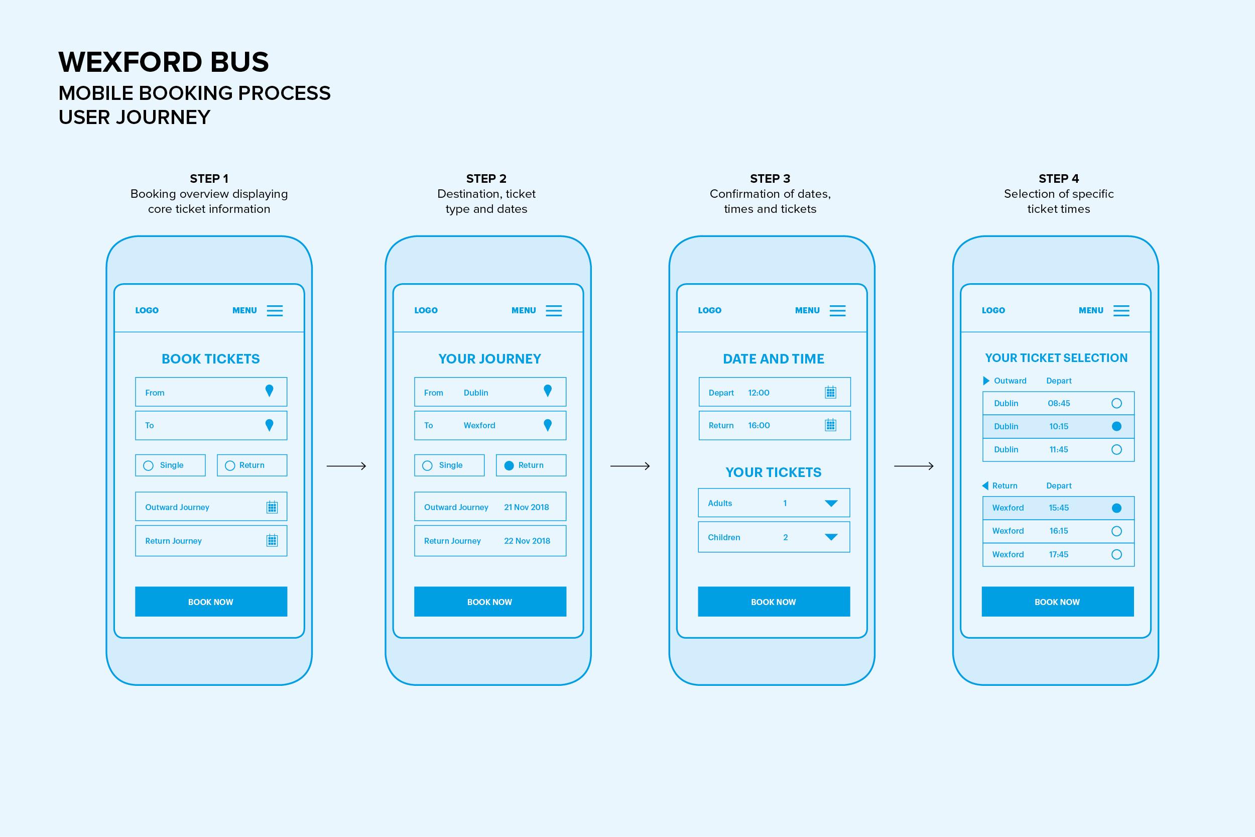
The sketches became a four-step mobile journey, planned in low fidelity wireframes before moving to high fidelity.
Three steps, one timeline
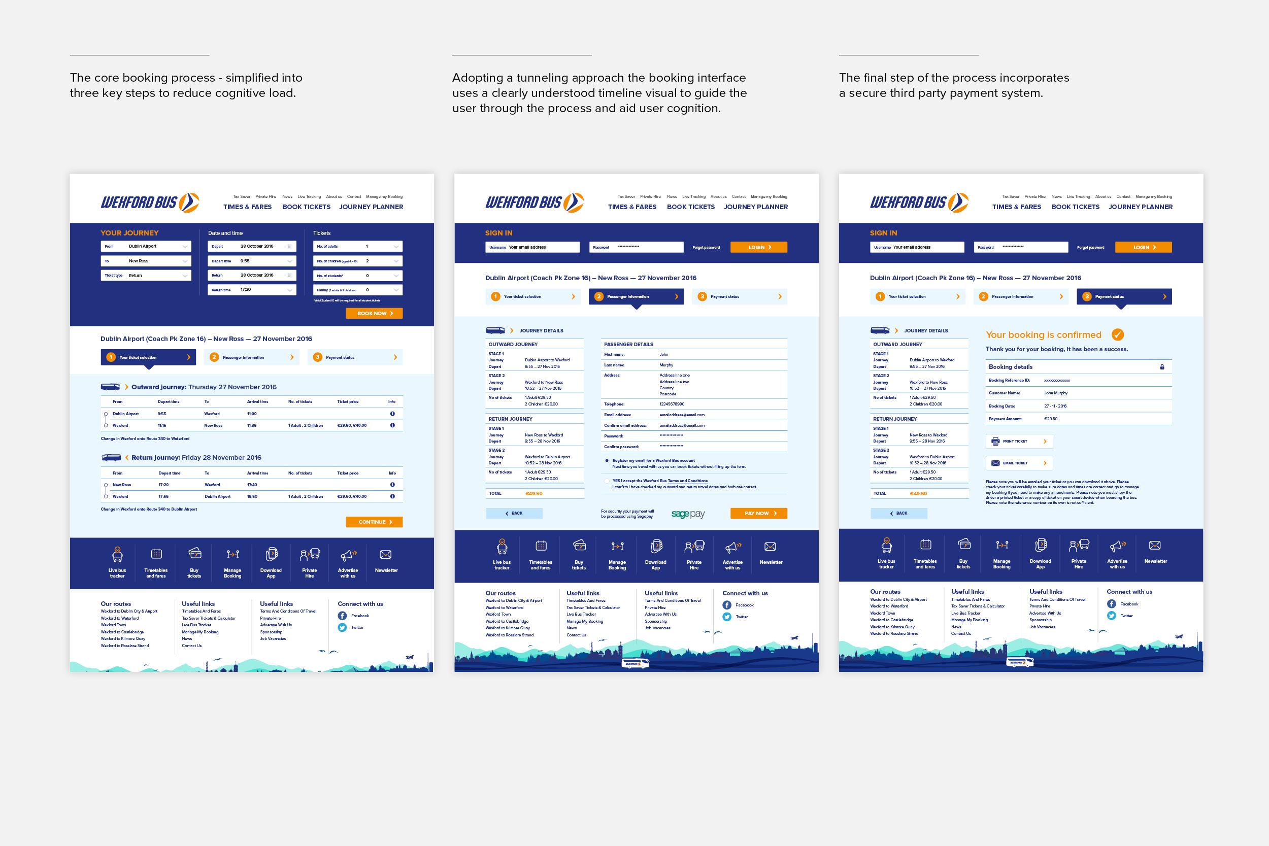
On desktop, the core booking process came down to three key steps, to reduce cognitive load: choose your tickets, add passenger information, pay. A numbered timeline at the top shows passengers where they are and what's left, a tunnelling approach that keeps them focused on finishing. The last step hands over to a secure third-party payment system.
Booking at the centre of every screen
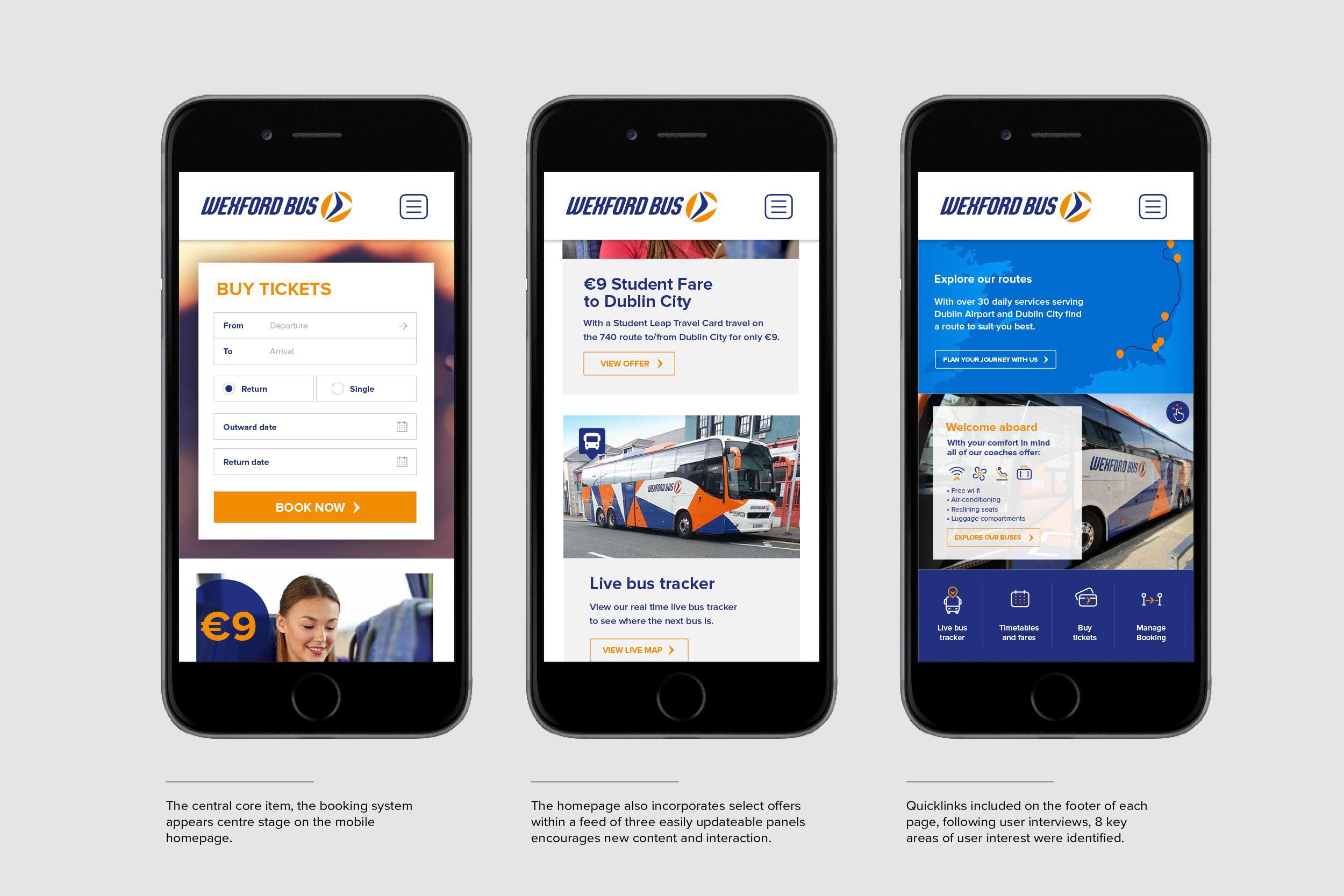
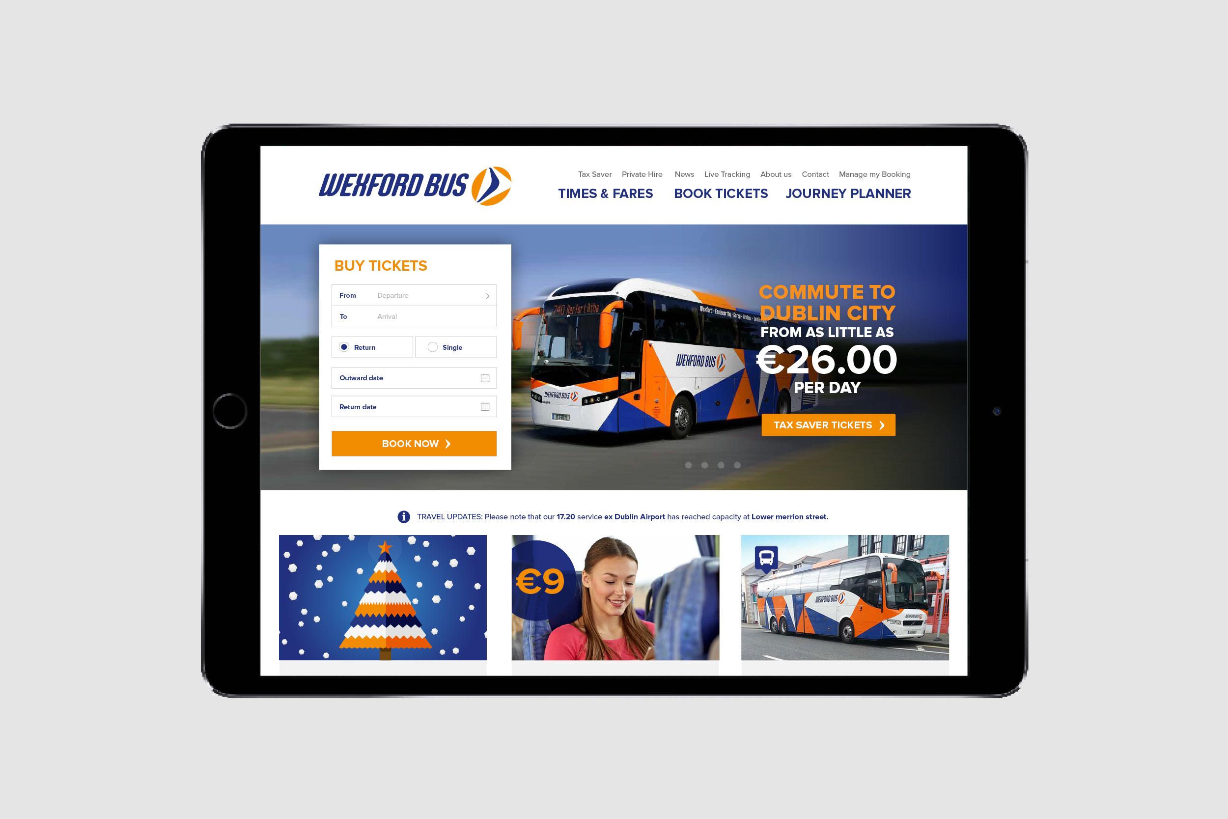
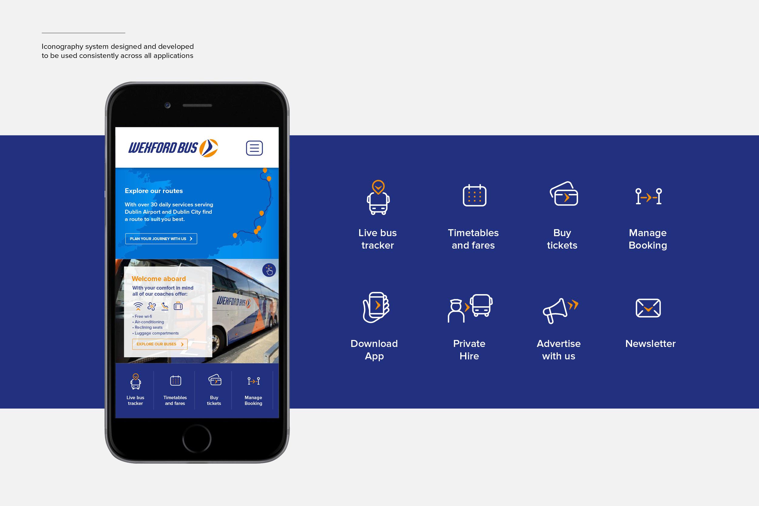
Booking is the core task, so it sits centre stage on the homepage, on every device. Below it, a feed of three easily updated panels carries offers and news. User interviews identified eight key areas of interest, which became quick links in the footer of every page.
One visual language everywhere
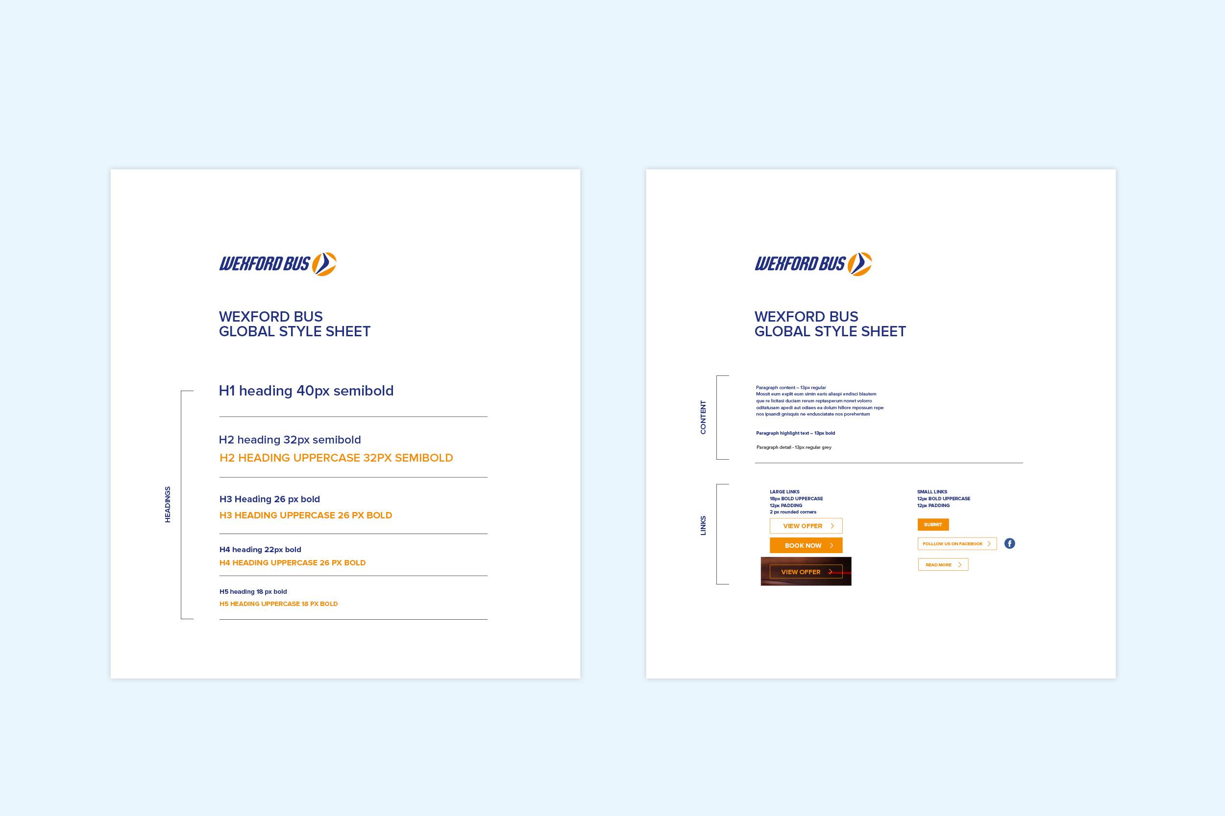
To keep the website and app consistent, I designed an iconography system used across every application, and a global style sheet setting out headings, body text and buttons.
Outcome
After launch:
- 19% more tickets bought in the first six months, with the simpler booking process
- 23% more traffic on average, organic and direct, from better SEO and site structure
- 12% higher conversion rate, from a more streamlined booking process
- 29% fewer web-related phone calls, thanks to a more intuitive interface
You can see the live site at wexfordbus.com (opens in a new tab).