No. 04MigroCase study
Launched a brand and website for an LED lighting start-up, and grew sales by 700% in eight months
The call
Cut the navigation down to two paths, the products and the Knowledge Centre, so every visitor faced one clear choice.
A name, brand and website for an LED grow-light start-up.
- Role
- Brand, UX and UI designer
- Team
- Migro's founders
Context
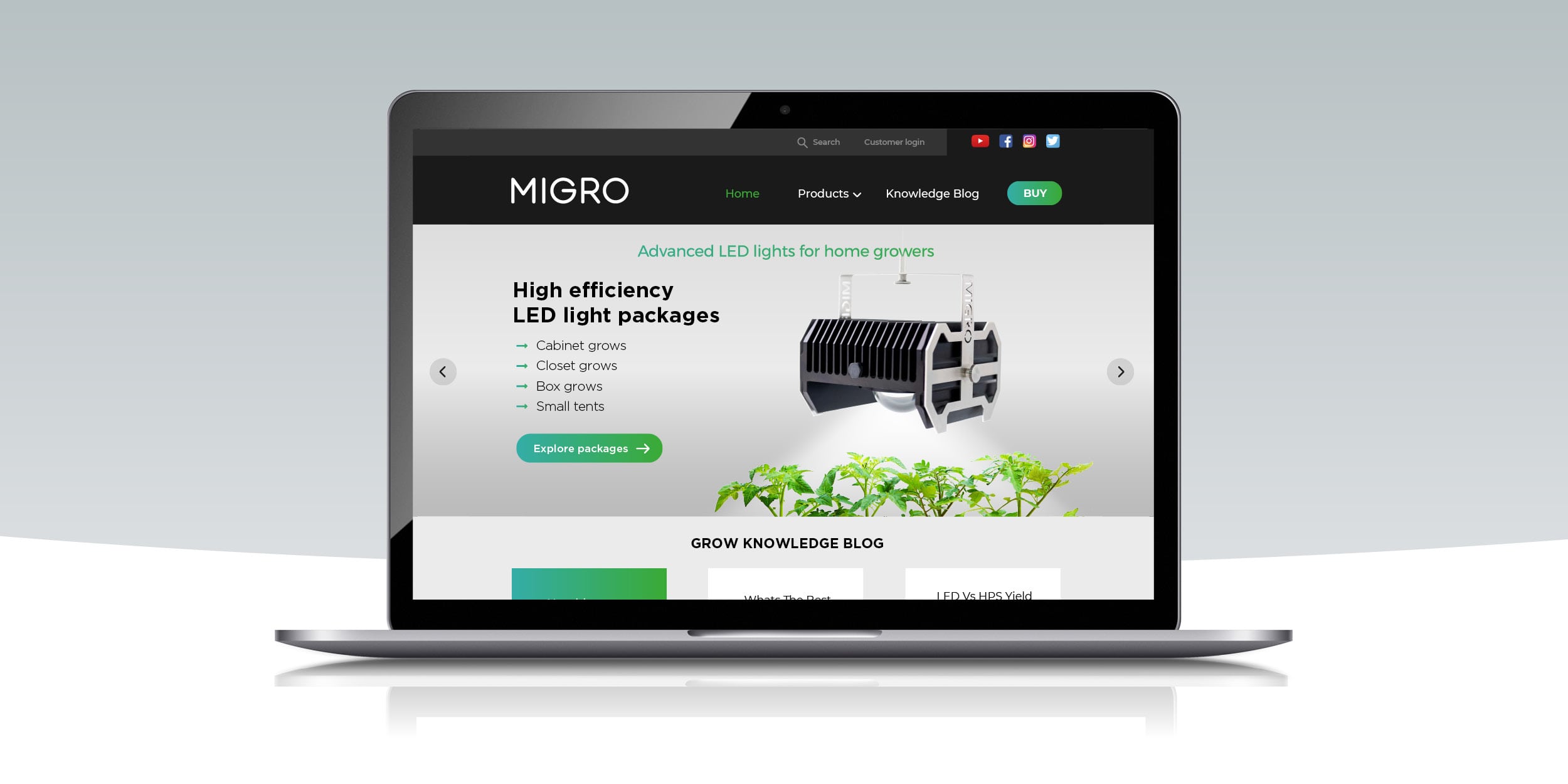
Migro is a start-up that makes high efficiency LED lights for home growers. It needed a brand identity and a product website, migrolight.com, that could sell to customers around the world.
The market was crowded with similar-looking products, so a distinctive visual style and a confident, assured tone of voice were essential to stand out.
I worked on every touchpoint, from planning through launch, review and testing: product naming, user research, user journeys and flows, wireframes and prototypes, brand and visual design, UI design, user testing, A/B testing and analytics.
The problem
The site had three jobs to do:
- Explain the product: make clear what Migro offers and why it beats the competition
- Show expertise: put the Migro Knowledge Centre front and centre, to get people engaging and coming back
- Build trust: give buyers confidence in the quality of the product and the people behind it
What I did
Mapping the customer journey
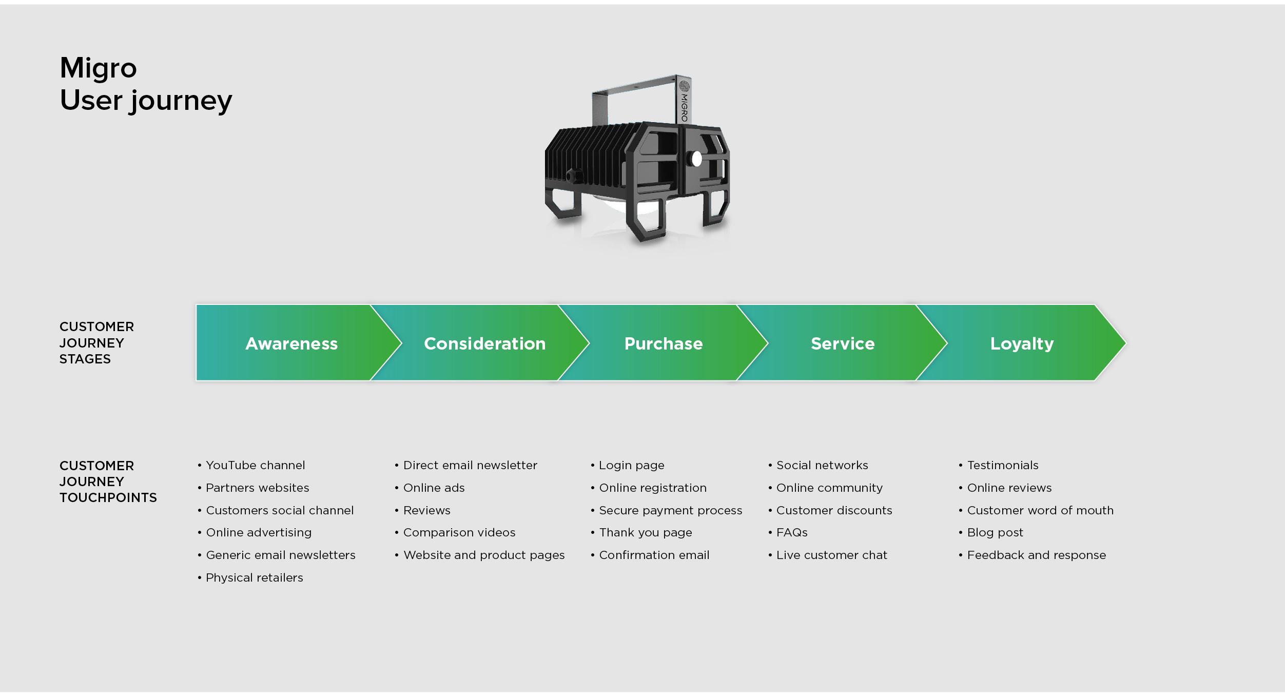
I started by mapping the whole customer journey, from first hearing about Migro to recommending it, and every touchpoint along the way. Many of those touchpoints sit away from the website, on YouTube, in reviews and through word of mouth, so the site had to work alongside them.
Two paths, not ten
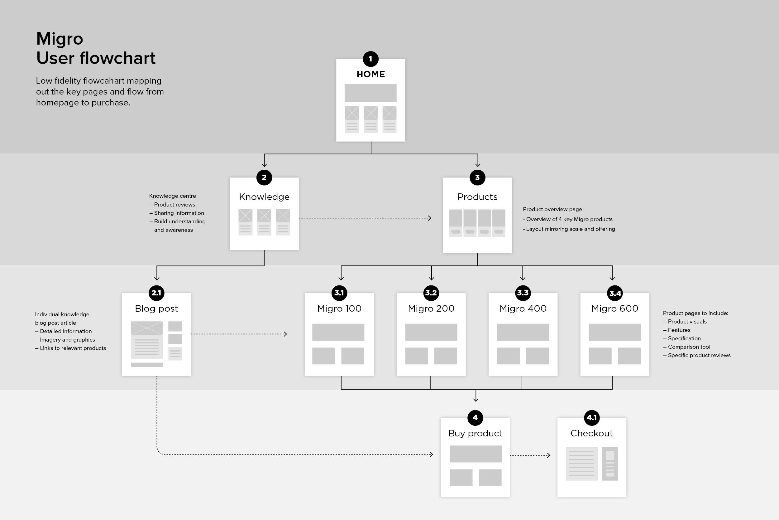
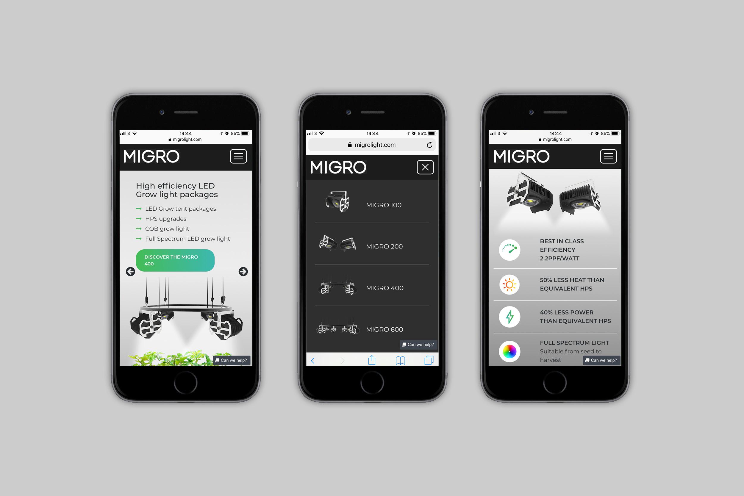
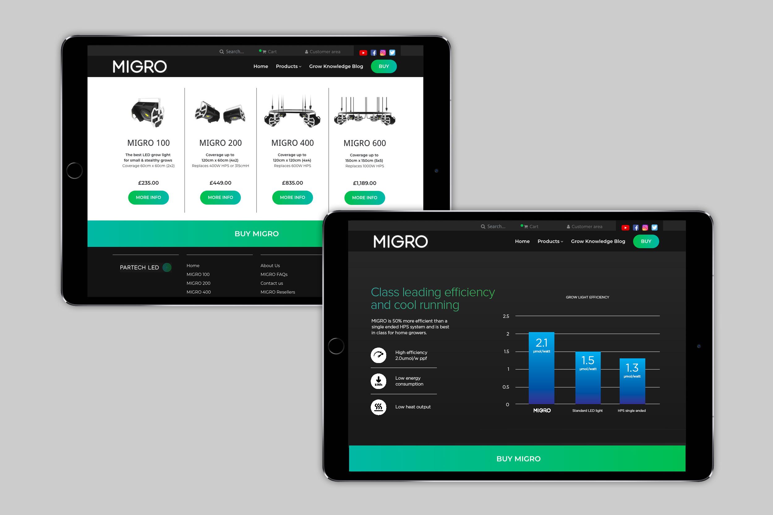
The core of the solution was to send every visitor in one of two directions: the product and its benefits, or the Knowledge Centre and Migro's expertise. Cutting the navigation down to those two reduced the cognitive load and made the decision easy. The Products menu lists each light by name, so the whole range is clear at a glance.
From sketch to site
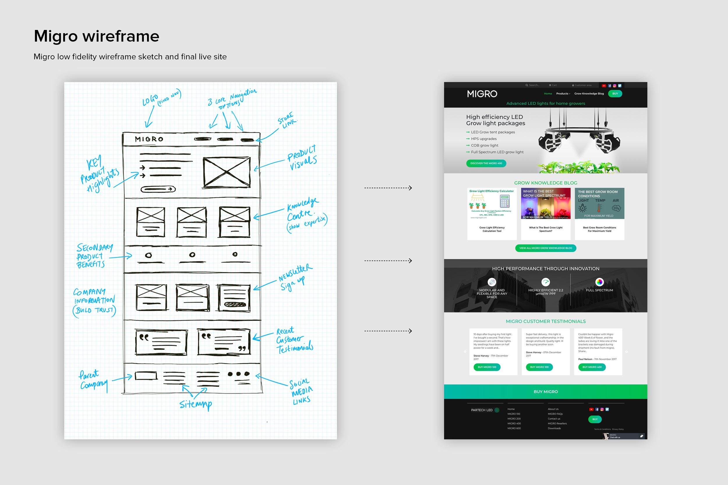
I sketched the homepage first, annotating the job of each section: key product highlights, the Knowledge Centre to show expertise, secondary benefits, company information and customer testimonials to build trust, and a newsletter sign-up.
Selling with figures, not adjectives
To show Migro's advantage over the competition, the design leans on figures and infographics: efficiency per watt, less heat and power than the equivalent HPS lights, and a chart comparing Migro with standard LED and HPS lights.
Outcome
After launch, we tracked the new brand and site through A/B testing and analytics:
- Trust: 700% increase in sales and conversions in eight months
- Engagement: 74% longer average visits, up to 3 minutes 20 seconds
- Visibility: 222% increase in traffic to the site
- Authority: 6,000 visitors a day to the Migro YouTube channel
- Profitability: 70% of sales coming directly through the website