No. 03My EirCase study
Rebuilt My Eir so prepay customers could register, top up and check usage in fewer steps
The call
Start with prepay customers and a mobile number login, and leave billpay for a second phase, so the most common journeys got simpler first.
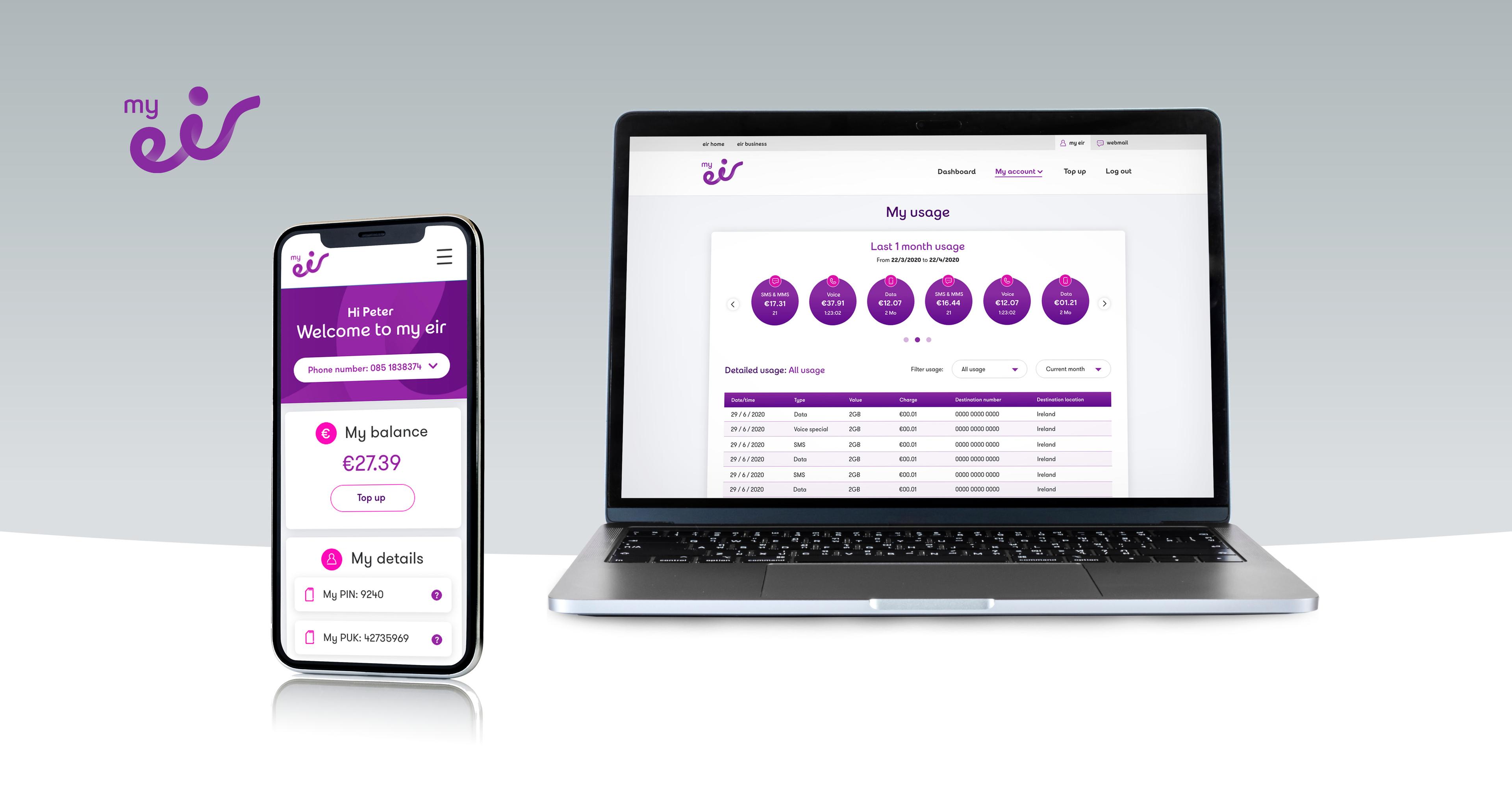
Eir's self-service portal, rebuilt around a simpler login.
- Role
- UX and UI designer
- Team
- Eir's digital team, with an agile development team
Context
My Eir is Eir's self-service portal. Customers use it to top up their mobile, check their data usage, and see and update their account details.
The portal worked, but it was hard work to use. Over six months I led its UX and UI redesign, working with Eir's digital team and an agile development team.
The problem
Getting into My Eir took too many steps, and so did most of what customers came to do once they were in. User testing showed where people got stuck, starting with registration and login.
The goal was simplification: fewer steps and actions to register, log in and get things done, and an interface that felt intuitive from the first screen.
What I did
I ran the project from discovery to launch: UX workshops and requirement gathering, user testing to find the existing pain points, low and high fidelity wireframes and prototypes, then close work with the development team through build, QA and A/B testing.
Mapping the journey
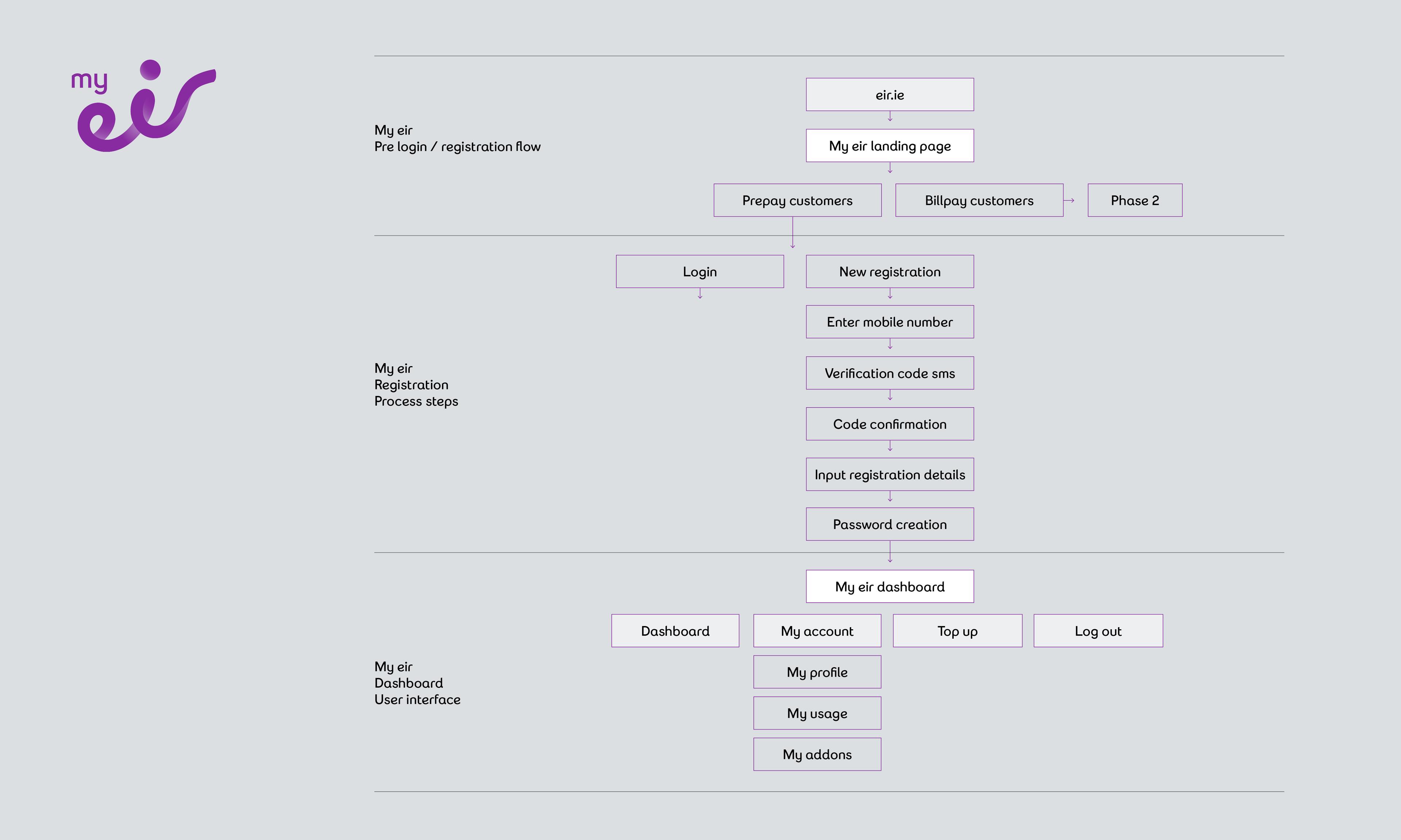
I mapped the whole service as one flow, from Eir.ie through registration to the dashboard. Prepay and billpay customers had different needs, so we scoped the first release to prepay and moved billpay to a second phase.
Wireframing every step
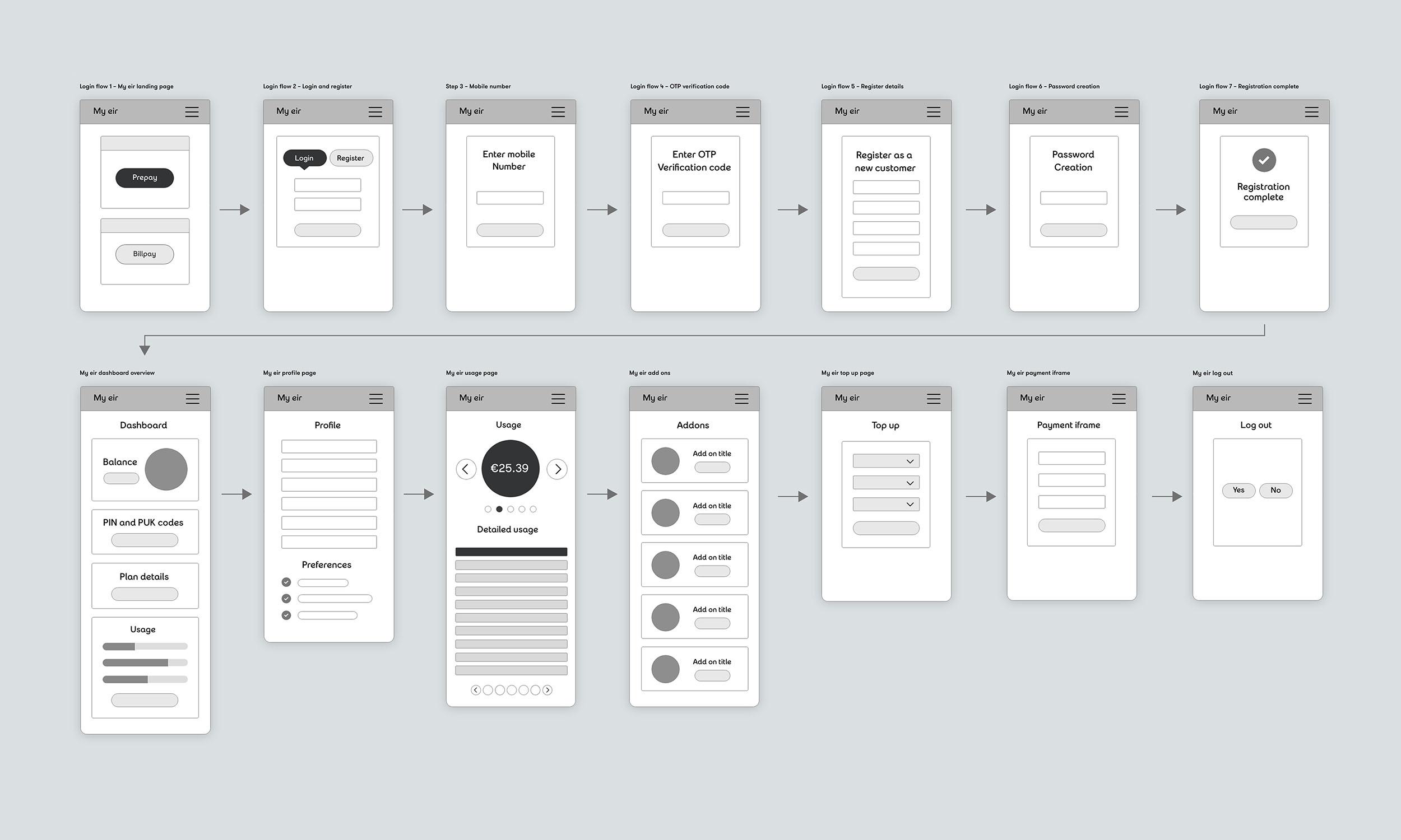
Registration came down to a short, predictable sequence: enter your mobile number, confirm a code sent by text, add your details and create a password. I wireframed it alongside every dashboard screen, so we could test the full journey before any visual design.
Designing for the phone first
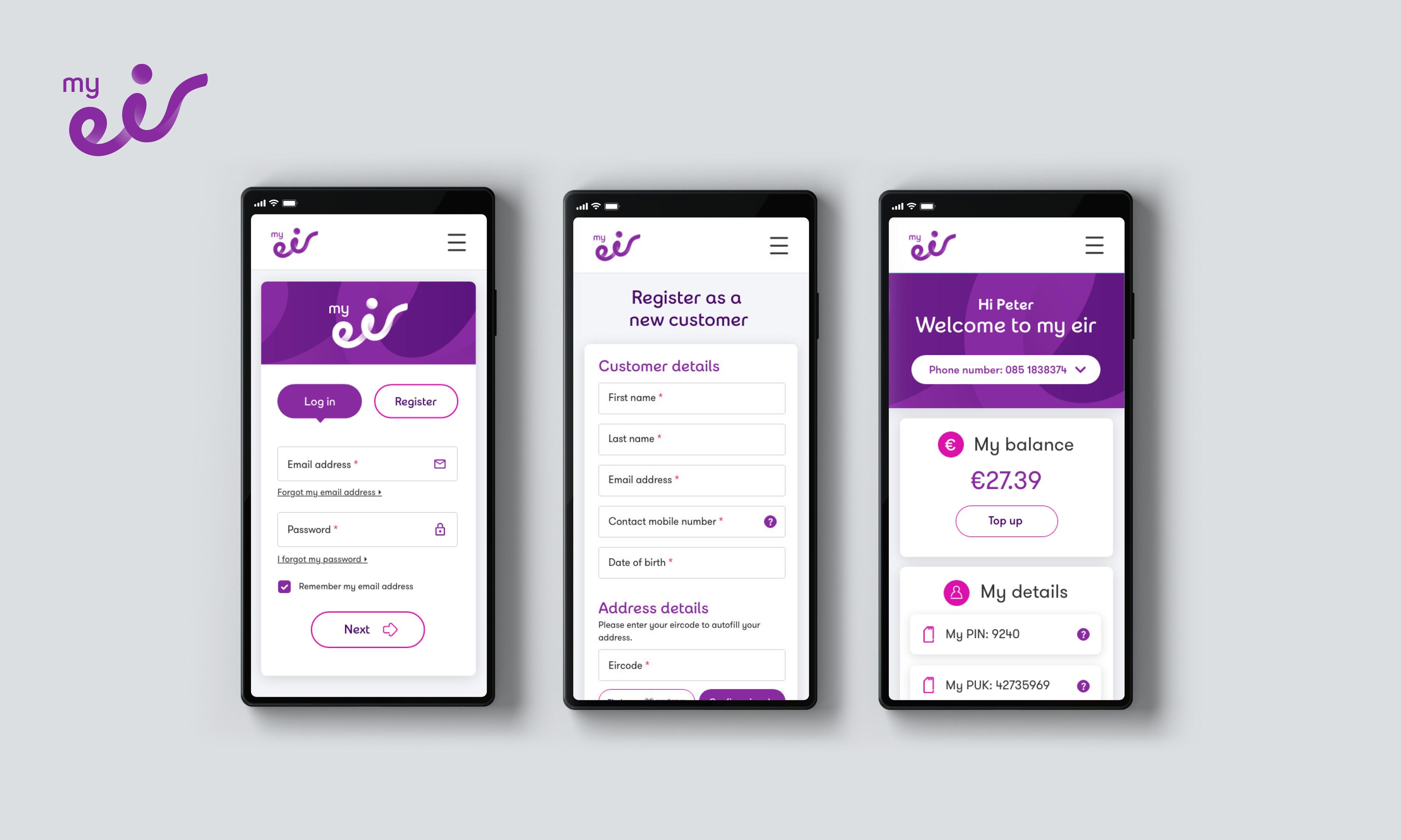
My Eir is where people manage their mobile, so the designs started on the phone. Log in and Register sit side by side on the first screen. Once signed in, your balance and a Top up button come first, with your PIN and PUK codes close behind.
Making usage easy to read
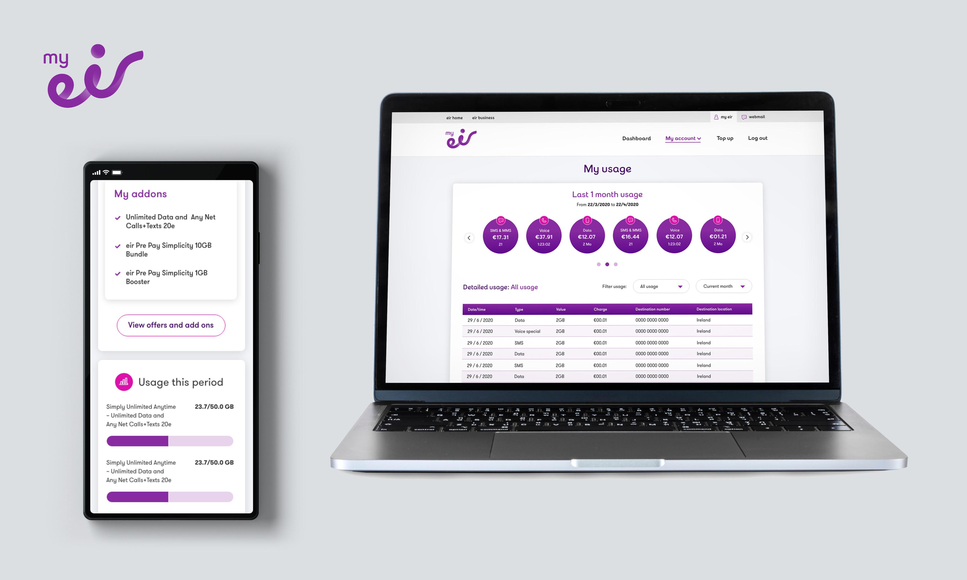
Usage was one of the main reasons people visited. The new usage page sums up a month of spend by type, then lets customers filter the detail, while the mobile dashboard shows add-ons and data used against each allowance.
Outcome
We validated the redesign with A/B testing against the old portal before rolling it out to customers.