No. 02Eir.ie journeysCase study
Redesigned Eir.ie's critical customer journeys end to end, lifting transactions by 14%
The call
Design each journey from first visit to purchase as one experience, starting with clear signposts to every service rather than a stack of competing promotions.
Clearer end-to-end journeys for Eir's broadband, TV and mobile customers, from first visit to purchase.
- Role
- Lead UX and UI designer
- Team
- Eir's strategy and digital teams, with an agile development team
Context
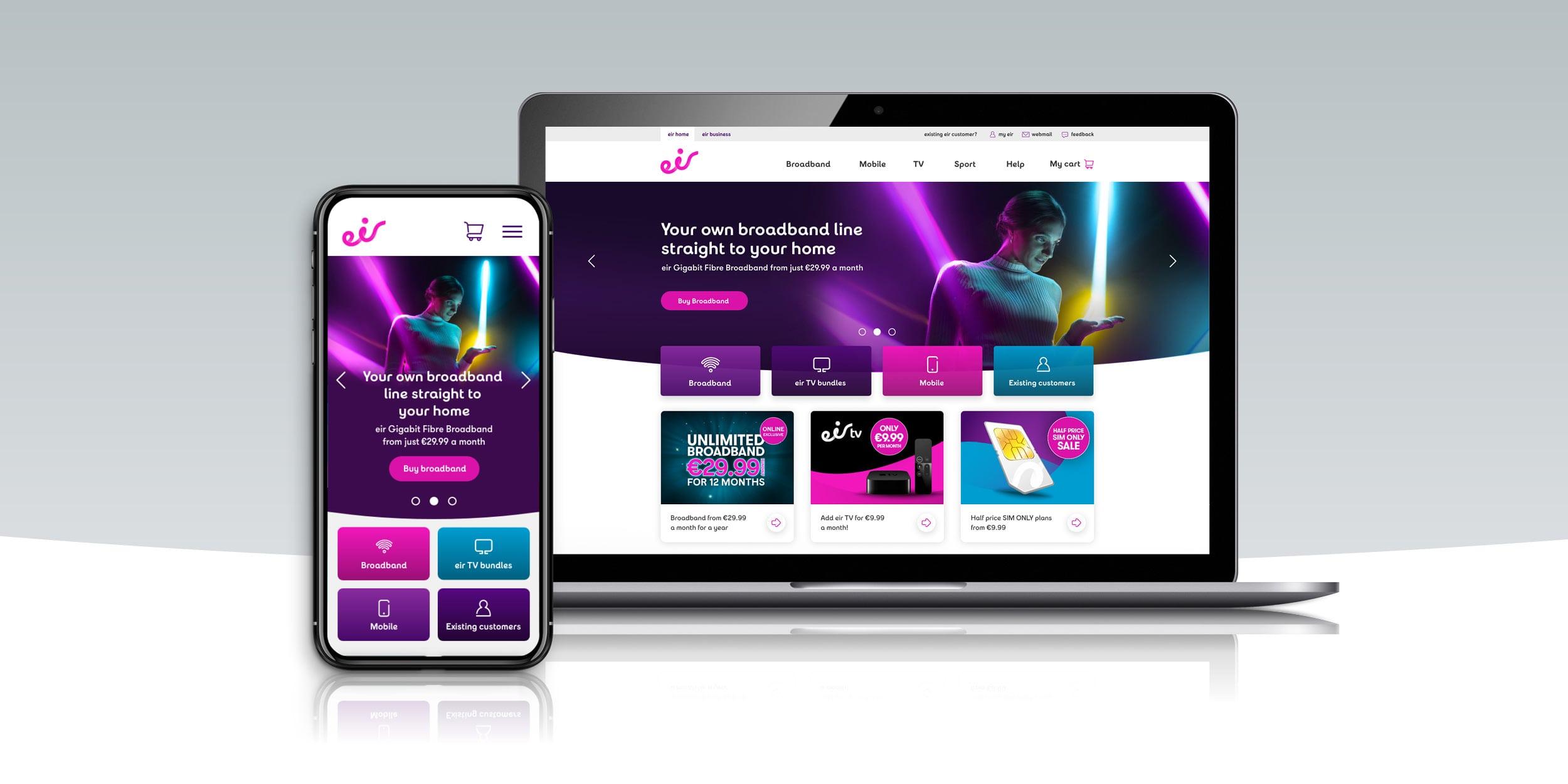
Eir is one of Ireland's leading providers of broadband, mobile and TV. Its website gets more than 20,000 visitors a week, and for most of them it's where they find, compare and buy Eir's services, or get help as existing customers.
The critical journeys through the site, from a first visit to a completed purchase, weren't working as well as they should. I led the UX and UI design of those journeys end to end over eight months in 2020, working with Eir's strategy and digital teams and an agile development team. The homepage, where most journeys begin, was the first and most visible part of the work.
The problem
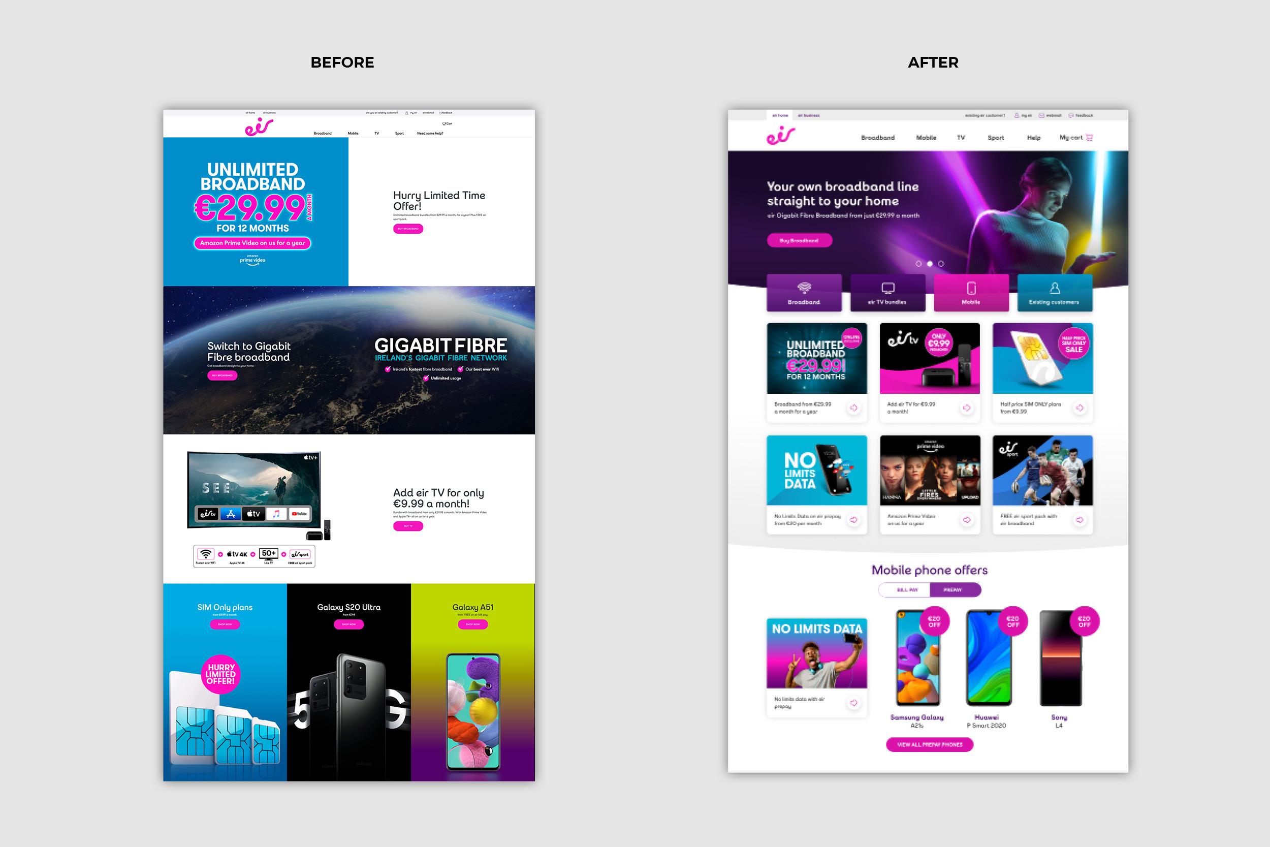
User testing showed that customers were losing their way. Visitors weren't aware of the full range of services Eir offered, and the homepage, a sequence of large promotional banners each competing for attention, gave no clear route into broadband, TV, mobile or support for existing customers.
The problem wasn't any single page. It was the journey as a whole: how people found what they needed, understood it, and got through to buying it. We needed to find and fix the pain points along each of the critical journeys, from the first screen to the last.
What I did
I ran the project end to end: discovery workshops and requirement gathering, competitive research, mapping the critical journeys and their pain points, user testing, low and high fidelity wireframes and prototypes, then close work with the development team through build, QA and A/B testing.
Testing with real customers
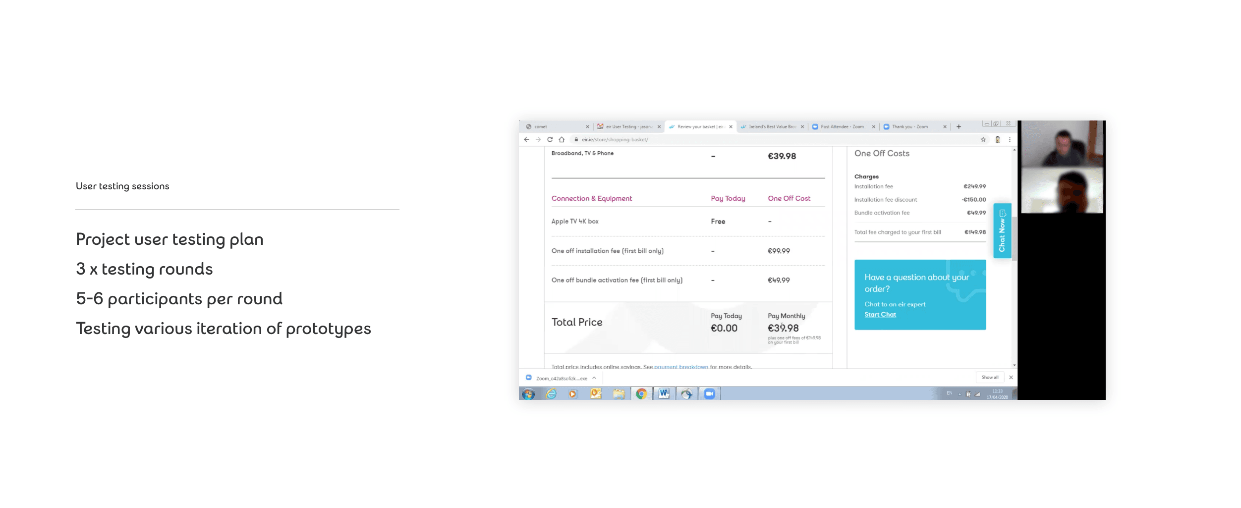
Rather than testing pages in isolation, we tested whole tasks, such as finding a broadband plan and getting it into the basket. That showed where people dropped off or got stuck, and kept the design honest as it evolved. The solution came down to four goals:
- Inform customers: help people understand the full range of what Eir offers
- Signposts and shortcuts: help people get to their destination quickly and easily
- Introduce brand and emotion: express the Eir brand in a more cohesive, consistent way
- Establish a design system: bring consistency to every communication
Mobile first
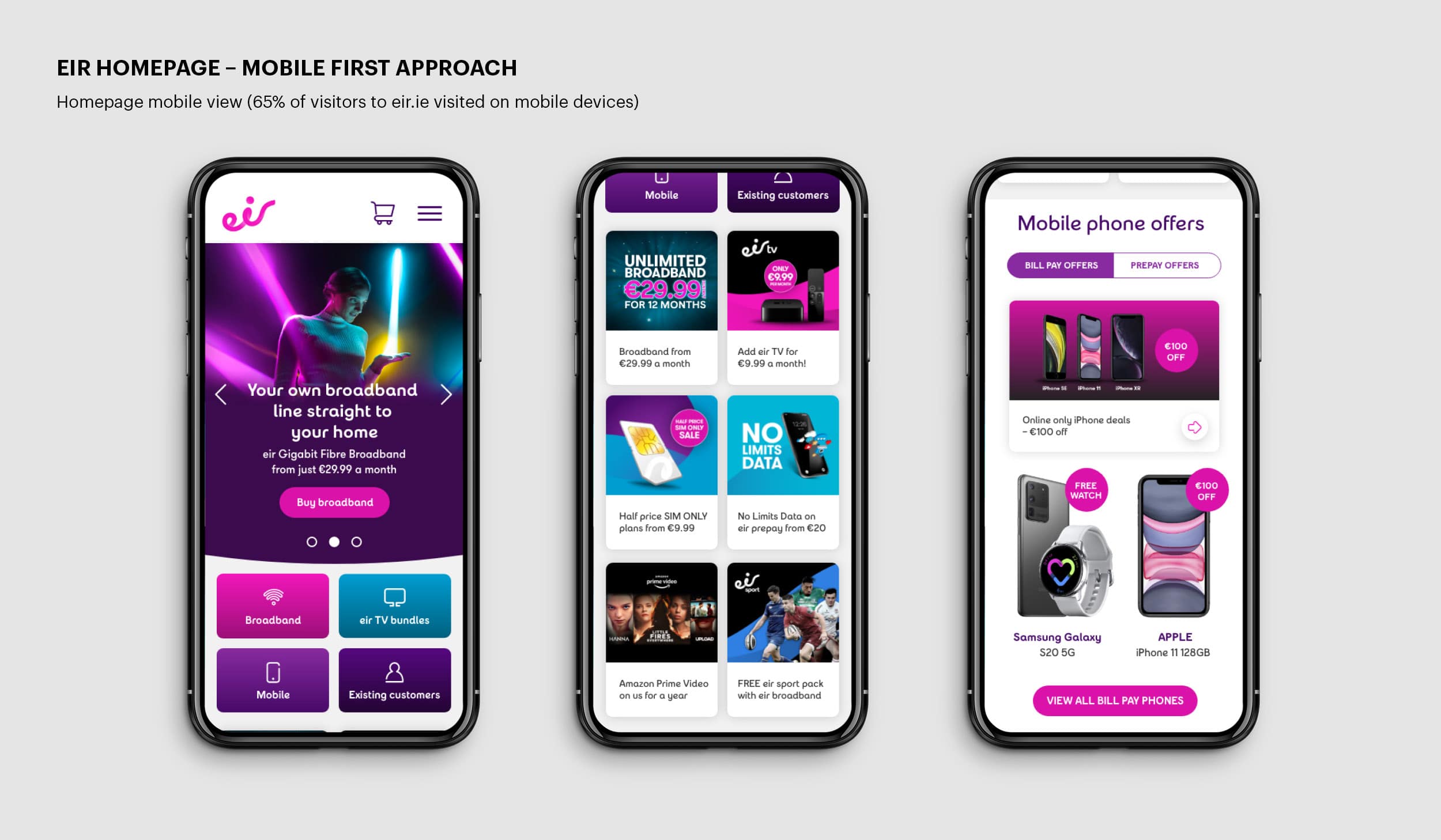
65% of visitors came to Eir.ie on a mobile device, so the journeys were designed for phones first. On the homepage, that meant shortcut tiles near the top to start each journey, offers in a simple two-column grid, and a dedicated section for mobile phone deals.
A design system for consistency
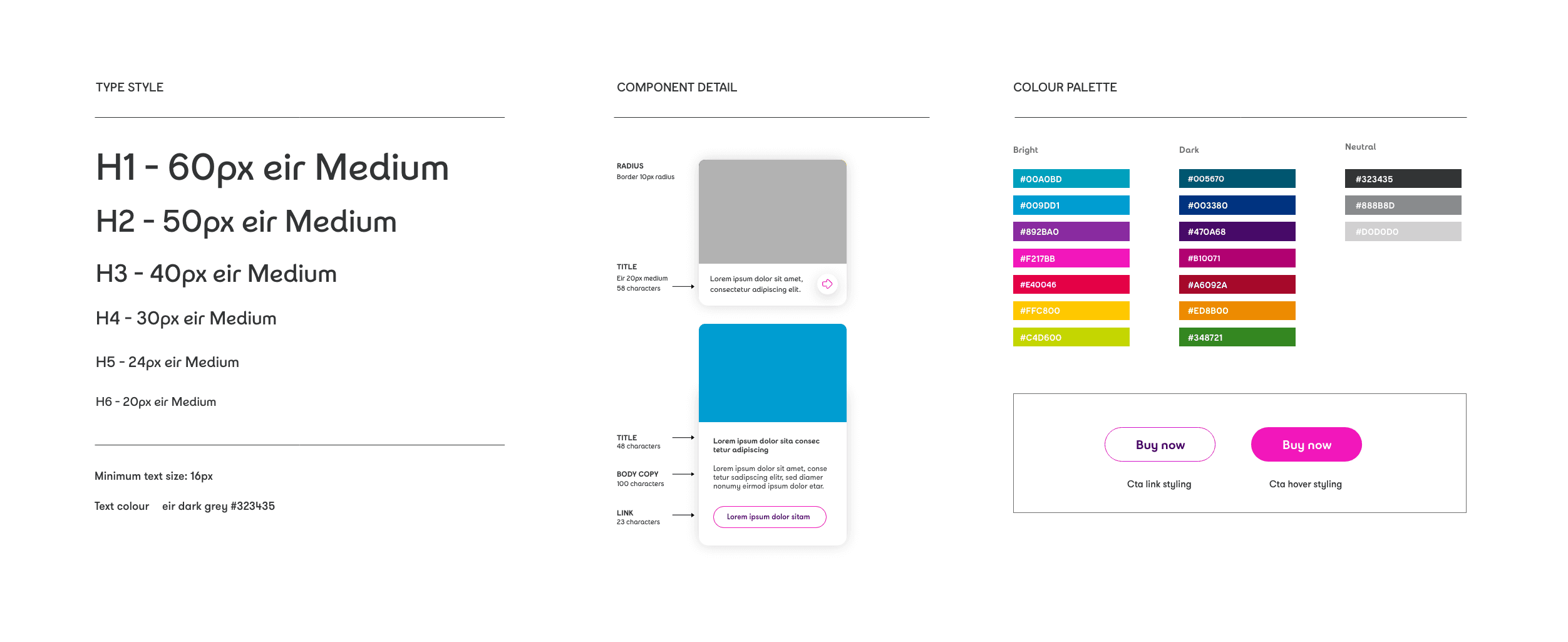
A journey only feels like one experience if every step looks and behaves the same way. To stop each page and promotion looking different from the last, I defined a design system: a type scale, a colour palette, card components with set character limits, and button styles.
Outcome
We validated the new design with A/B testing against the old one. Over the course of the test:
- 14% increase in transactions
- 11% more time spent on the site
- 6% lower bounce rate
The new journeys now serve more than 20,000 visitors a week. You can see the live site at Eir.ie (opens in a new tab).